Classification problems: lift curve or classification table?
The common idea of classifying is to look at “small groups” of records, and evaluate if we should put them a 1 or a 0 when it comes to a particular target.
For example, if I am interested in figuring out who will get cancer, I can “build” the following logic, without requiring any predictive models:
Smokes since is 15 –> More than a pack per day –> Is more than 50 -> (s)he will get cancer .
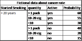
However, while such logic may make some sense, we all know someone who has smoked for over 50 years and is still healthy. Therefore, we need facts, and it is a good idea to organize the data in a table (warning; fake data):

One common misconception (which we get from school) is that we will classify things if they are “above” 50%. Such value occurs very rarely in reality. If we look for probability of cancer, few people will get more than a 50% probability of developing cancer within the next 10 months. This is misleading. It would mean that those who have smoked more than a pack of cigarettes per day during 20 years will not get cancer just because they stopped. It is true they will be less likely to have cancer than those who keep smoking, but the risk is still there , and quite high nonetheless.
An interesting idea is to use the concept of “odds” instead of probability. Odds are often used in gambling settings, and representthe ratio of one event versus another. For example, odds of 10 to 1 mean that event A is 10 times more likely to occur than event B. So, even when probabilities look small, when we compare them to the prior probability (the probability of the population without a model), the interpretation can change drastically. Let’s consider the global probability of having lung cancer at some point in life: 7.43%. Let’s make a small simplification and say that this will only occur after 30 years old, and until 80. So, the probability of developing cancer at any point during the next 50 years is 7.43%. Let’s simplify even further and consider that the distribution is uniform with age (stable), so for any period of 1 year, the probability is about 0.1486%, almost nothing. A probability of 15% is therefore 100 times higher than the “normal” probability, and individual in this particular group should be watched closely to try to avoid complications.
The same logic of establishing conditional probabilities and rules can be applied to any business problem. For example, we can easily establish classifications such as:
- People who purchase cereals will also purchase milk
- People who have a bank account will have a credit cards
- People who have seen an increase in income will want a better car
- People who just bought a house are less likely to spend a lot on holidays
All these examples are trivial, and any marketing manager will think of it on its own. The problem is that human beings are not trivial, and are highly multi-dimensional.
For example, what happens if someone had an increase in income, bought a house, got married, and paid off his credit cards debts? What if this income increase is more than 4%? And what if (s)he two other credit cards? Does it matter if (s)he is less than 30? How about education level? All these distributions have to be estimated, some on category, some on continuous basis, and all mighthave an impact on what we are interested in.
In data mining, we tend to talk more about “scoring”, which consists of ordering individual based on their probabilities and prioritizing attention.
In statistics, and introductory quantitative marketing courses, we often use the “classification table” or “confusion matrix” as a main model evaluation metric (this is what is usually applied with logistic regression, for example). We simply count the percentage of correctly and incorrectly classified records, and compute the hit rate (percentage of total correct classification):
| Predicted 1 | Predicted 0 | |
| Real 1 | X (x%) | 1-x% |
| Real 0 | 1-y% | Y (y%) |
Total classification (hot rate) = (X+Y)/N. For example:
| Predicted 1 | Predicted 0 | |
| Real 1 | 450 (90%) | 50 (10%) |
| Real 0 | 50 (5%) | 950 (95%) |
Hit Rate = (450+950)/1500=93.3%
This usually works quite well with balanced dataset, as a probability of 50% allows for a clear cut. But, when we try to apply such method in practice, we run into small problems as the target is more often than not completely unbalanced. Let’s say we are interested in a fraud problem and have the following classification:
| Predicted 1 | Predicted 0 | |
| Real 1 | 0 | 50 |
| Real 0 | 0 | 1.999.950 |
Hit rate: 99.9975%. We have an almost perfect model, yet a particularly useless one, as it suggests nobody is a frauder. On another extreme, we could have the following results, with the same model (but a different cut-off point for classification):
| Predicted 1 | Predicted 0 | |
| Real 1 | 45 | 5 |
| Real 0 | 950.000 | 1.000.000 |
How we classify all depends on where we put the threshold of considering a “1” vs a “0”. On average, this last model performs very poorly, but it has detected 90% of the target with 50% of the population… which isn’t all that bad. So, the total hit rate is a pretty bad metric, and we need to use something else.
Another approach to evaluate a model is to use “purity” methods, such as the lift curve. We no longer focus on “properly classifying things”, we know that for small target, the percentage of correct classification will always be low. We focus on having the highest percentage of true positives in the smallest possible group.
Most software user the ROC Curve: Receiver Operating Characteristic, in which the X axis represents the false positive rate, and the Y axis represents the true positive rate. The higher the curve, the best the ratio of true positive vs false positive, hence a good model. In Timi, we chose to use another metric, because the ROC is actually not that good, and we prefer to use the lift curve, as explained below.
Gini is an index of purity, identical to the Area Under Curve (the percentage of the square explained by the model). In terms of economics, a population is perfectly unequal if one person has 100% of the wealth, this would be a Gini of 1. if the wealth is perfectly distributed (everyone has exactly the same), then authors disagree. Some say Gini is worth 0, other say it’s worth 0.5. It’s easy to understand why if we look at the following chart:
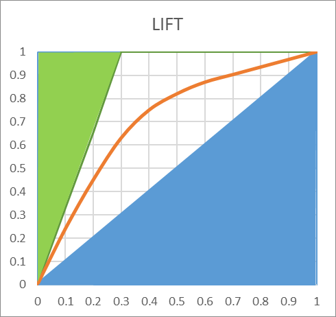
The green area is removed from the computations, and if we consider the blue area, we can decide to include it or not in the AUC. In the lift curve, the worse possible model would the the 45 degree line, any lift going below would be inferior to a random selection.Including this area in the AUC would make little sense, as it would artificially inflate its value. In our example, the AUC is 0.74, including the entire area.
This doesn’t mean that the model performs at 74% of a perfect model. If we only count the superior area, we set the TOTAL area to the top 50%. So, the AUC is actually 48% ((74-50)*2). This is a very different appreciation. Our model, which looked amazing on the AUC, and spectacular on the ROC curve, only explains 48% of the area that could be explained. It’s frustrating, but much more realistic.
Now, the TOTAL AUC doesn’t really matter, if the lift is good, having problems at the right end of the AUC is usually not such a big deal. So, the best metric is probably the lift, or the AUC Top included in the output of Timi modeler.
So, when comparing LIFT: make sure you don’t compare apples and oranges. One very small target, the LIFT curve will look a lot like the ROC curve. But on a balanced dataset, the lift curve will look very bad. However, it may actually be much better. To fairly compare models, it is important to apply them on a set dataset using the same metric, or run the data through the “Lift Curve” action in Anatella.
 When comparing Gini, make sure the same rule is used to compute it. If the TOTAL AREA is used, you need to apply the formula (AUC-0.5)*2 to approximately compare the two.

