Lift, ROC, AUC and Gini
One good way to compare different predictive modeling platforms is to compare the models that are produced by these platform.Comparing models across platform is not an easy task. Models can be compared using various criteria’s:
1. Simple predictive Model Quality (i.e. Height of the lift curve / AUC)
2. Generalization ability of the Model (Difference of model quality between Creation set and Test set / Does the model overfit?)
3. Explanatory Power of the model (Does the model “make sense” of the data? Can it explain something?)
4. Model Stability (What’s the confidence interval of the model on the lift curves?)
5. Is the model robust against the erosion of time?
In this document, we’ll only focus on point 1: Simple predictive Model Quality. When estimating the quality/accuracy of a predictive model, it’s very important to use a BACK-TESTING dataset, as the real quality of a model is how much it predicts the future, not how well it learned on our learning dataset. And in all cases, do test. At least a simple test set, or (a bit better) cross-validation. But the results that matter are time validated, using a back testing method.
When it comes to model quality , we talk about lift, lift curve, ROC, AUC, classification, or GINI, and it can be cumbersome to make sense of it all. We will not cover the confusion matrix (and all the metrics derived from it), this one is easy to understand, and really not a very good way to interpret results (that will be a topic for another post)
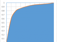
Let’s have a look at a ROC chart first
The ROC curve is very familiar and quite easy to understand (but not really the best one to use): the data on the X axis represents thefalse positive rate of my database,the Y axis represents the true positive rate. The higher the curve, the best the ratio of true positive vs false positive, hence a good model.
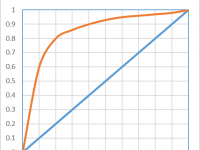 The LIFT, in this case, is typically how much better the model performs on the top 10% of the base. In this case, we see we have 6 times more true positive than false positive in the top 10%, hence a lift of 6.
A perfect model would return a squared ROC, that is, a model in which there is no misclassification: we reach 100% true positive at the 0% false positive point. A perfectly bad model (two distributions overlapping) would return a 45 degree line, as there would be 50% true positive and 50% false positives.
The AUC, or Area Under Curve is typically the total area under the red curve, which is pretty easy to compute as the total area of the square is 1. For a perfect model AUC would be 1. A random model would give the same amount of incorrect classification, on the 45 degrees and the AUC would be of 0.5.
In this case, we have an AUC 0f 0.74, which is a pretty good model. this means that 74% of the total area is explained by the model.
This AUC is also the GINI of the model, reported in many other tools, but there are two ways to compute it, as we will see later.
The LIFT Curve illustrates a related, but different concept than the ROC curve. When building a predictive model, we do not always have a clean 50% split between target and non targets. Actually, most situation (around 90% of the cases) present a very small percentage of targets, and balancing the dataset is not always a very good idea (and this is a topic for my next post). The LIFT CURVE integrates the percentage of targets on the charts, relaying the same information as the ROC, but with a twist:
The X axis is now a sorted list of the total population. The Y axis no is still the true positives, which represents the percentage of target properly identified in the selection.
For data mining purpose, this is actually better. When we create a score, we usually want a certain number of “candidates”. It’s not about having the “purest” group, in this case we would just take the top 0.01% of the list and have an almost perfect classification. We want to take as many candidates as profitably possible. If we investigate fraud, the goal is not to have our auditors find 100% of positive cases, we want them to find as many positive as possible, with the lowest effort. If we want to make a marketing campaign, the goal is not to have the higher conversion rate (this would be the wrong KPI!), but rather to sell as much as possible, with the highest profitability. So, the most important KPI is: what percentage of the total target is identified with the smallest possible group. This is what the lift curve illustrate.
The main difference will be in terms of LIFT: in this case, we maintain an AUC of 0.74, but with a lift that seems to be at around 2.5. This seems very small. But with the amount of targets we have (in this case 30%), the MAXIMUM lift would be a lift of 3: if you select 10% of the total population, at most you would get 30% of the total TARGET. So, the lift looks bad (2.3), but it is still 70% of the maximum reachable.
Let’s now talk about AUC and Gini
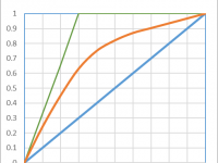
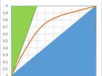
Gini is an index of purity, identical to the AUC. In terms of economics, a population is perfectly unequal if one person has 100% of the wealth, this would be a Gini of 1. if the wealth is perfectly distributed (everyone has exactly the same), then authors disagree. Some say Gini is worth 0, other say it’s worth 0.5. It’s easy to understand why if we look at the following chart:
The green area is removed from the computations, and if we consider the blue area, we can decide to include it or not in the AUC. In the lift chart, the worse possible model would the the 45 degree line, any lift going below would be inferior to a random selection.Including this area in the AUC would make little sense, as it would artificially inflate its value.
In our example, the AUC is 0.74, including the entire area. This doesn’t mean that the model performs at 74% of a perfect model.
If we only look at the area above the diagonal, the AUC of our model is actually 48% ((74-50)*2) of the area of the perfect model (i.e. the area between the green line and the diagonal blue line). This is a very different appreciation. Our model, which looked amazing on the “ROC-AUC”, and spectacular on the “ROC-Curve”, only explains 48% of the area that could be explained. It’s frustrating, but much more realistic. Now, pn most situation, the TOTAL AUC doesn’t really matter: i.e. if the lift is good on the left side, having problems at the right end of the AUC is usually not such a big deal. So, the best metric should probably focus on the left side of the lift, or the AUC (e.g. such a metric is available inside Timi: it’s the “AUCtop”)
So, when comparing LIFT: make sure you don’t compare apples and oranges. one very small target, the LIFT curve will look very similar to the ROC curve. But on a balanced dataset (with 50% target), the lift curve will look very bad. But it may actually be much better than the model that gave the ROC curve.
When comparing Gini, make sure the same rule is used to compute it. if the TOTAL AREA is used, you need to apply the formula (AUC-0.5)*2 to approximately convert one metric into the other.
If you have Anatella, you can simply use the compute lift node (for a Binary Target – for a continuous target, you shouldn’t use the “Compute Lift” node but rather the “R²” node) and apply it on the various scores computed, this will put all the models on the same “Scale”, no matter what tool was used to build them.

I hope this helps. Happy modeling!

