Let’s stop misleading our users with
meaningless classification rates!
I recently watched an interesting video of Eric Siegel, in which he talks about the Accuracy Fallacy. This is a theme I often talk about and touched (although not as clearly as he did) in another post a few years ago, when I wrote about classification, ROC and Lift (Gain) curves. Siegel really coined the term very well and motivated me to write this little post, and a term I will use frequently from now on.
In the data science community, we have a bad tendency of overly exaggerating the quality of our models, often not consciously. We are simply trained to use the wrong KPI, and the general population understands them even worse than we do.
When I learned classification techniques back in the late 90/early 2000, the KPI we all used was the classification table, expressed in percentage, and nobody seemed to have a problem with that.
Then, the ROC took over, which is already a huge improvement, as it expressed the dynamic component of a classification table. The classification assumes a constant cut-off in terms of probability, often 50% or an “optimum” point set to maximize hit rate, or accuracy.
But this gives a very misleading confidence.
Let’s take this simple example of a very good predictive model.
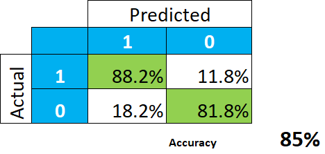
This indeed looks wonderful. The conclusion is that the model gives us 85% hit rate (the average between 88.2 and 81.8), or accuracy, and we should not expect a whole lot of misclassification.
Or should we?
Often, reality is really unbalanced, and the apriori probability is to 1 o 2%. Let’s take an example, say probability of paying declaring a high income, which it is around 6%. The ROC curve would of course look as good as – or even better than – the classification table:
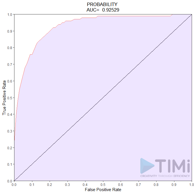
So, what do we conclude now? We have an incredible model, with 85 to 92.5% quality! Nothing can go wrong, and what a non data scientist will understand is that all tax payers will be identified, with maybe 7.5-15% error. It is not the case, and this bad (scary!) interpretation is our fault.
Let’s have a look at how the data is actually classified, in absolute numbers. And instead of focusing on how many of the TRUE positive and negatives are classified, let’s look at what the model tells us is a positive :
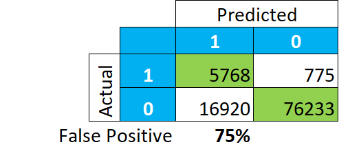
This paints a completely different story. Among our classification of “TRUE”, 75% of the records are actually “FALSE” (16.920/(5.768+16.920)). Meaning that if we look at tax payer in this group, we will not find 85-92% of actual payers, but merely 25.
The GAIN curve lets us understand better what is going on:
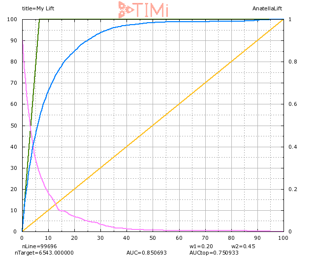
When we select 20% of the population (on the X axis), we indeed see that 85% of the targets are identified. But we also see that we selected a sample about 3 times as large as our apriori group (visible on the green line:6% on the X axis), hence we can expect that a LOT of records in this group are actually negatives. At 20% of the population selected, the probability of being true of the least probable record is around 6-7% (see the light blue curve).
So, let’s get realistic for a minute: we don’t actually classify things. And if we do it, let’s admit that we suck at it. What we can do properly – as shown here – is called ranking. Ranking models are an incredible tool to prioritize and sort records, they help make decisions that generate millions or euros in many industries. But we are nowhere near the point where an algorithm will tell us with a low margin of error who a bad payer is, who a future bad student is, or who a future bad employee is. It will steer us to the right direction, but unless the actual probability of event for a record is >0.99, it is dangerous, and irresponsible, to say that we “classified” it.
Stop being afraid of the truth: This a GREAT model, if you take the top 2% of the population, you will have 70% of actual positive (instead of 6%!), the “lift” is 6.5 at 10%. We don’t need to generate false expectation and talk about those 85%+ rates .

