Visualize Clustering with SOM in Anatella / R
Note: The data is extracted from Marketing Engineering, with the kind permission of Dr A. De Bruyn. A very complete R code for SOM can be found in the excellent post of Shane Lynn http://www.shanelynn.ie/self-organising-maps-for-customer-segmentation-using-r/
Clustering is a tricky business. while the hardest part of it lies in the business process, there is also a lot of challenges when it comes to picking algorithms.
There are several algorithms (and R packages) that help analysts find the underlying groups in data clouds. The classic way, which we all learned at school is to use Hierarchical Clustering to select the number of segments, and K-Means to find the actual groups, using many variations around the same logic (such as Minimum Spanning Tree, or K-Medoids, etc.).
Another approach is to use distribution based modelling to figure out which is the most likely solution under a set of hypothesis. The two leading algorithms here are MClust (really neat), and Latent Class. While the best implementation of the latter is the well known Latent Gold, I found a good implementation in the PoLCA package.
And there is one quickly gaining in popularity: Segmentation with Kohonen. This is a hot topic (heat map, see what I did there?), and many analysts are using it to make segmentation decisions. While there exists some publications that suggest that Kohonen is a good idea, it seems to me that most of these publications were tackling very particular problems: i.e. The data had only two dimensions, or there was an awful amount of noise in the data. In these particular conditions, Kohonen does a tremedous job at properly representing the data, but in most business situation, I still believe other method yield better output.
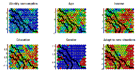
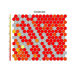
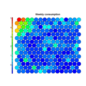
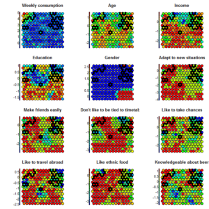
To understand this point, and this is critical to properly make conclusions regarding the segments, let’s have a (very intuitive) look at what Kohonen does. Without entering in details (and over-simplifying quite a bit), Kohonen reduces the data in two dimensionsand gives some “clusters” which are represented by dots. The idea is to reduce all the variable in a common 2D space in which the means per group are represented by a color code. If we look at the following chart, we see that we created a 20×20 space, in which each “dot” represents between 1 and 7 points grouped together, and there are some empty spaces in grey (this is a very tiny dataset). We can then visualize variables on this space using the heat map. On the right, we see that the population at the top-left of the space has a higher “weekly consumption” of the product:
From this, we can apply a segmentation very easily. In the R language, the Kohonen library includes a functionality for it:
add.cluster.boundaries(som_model, som_cluster)From this, we can apply a segmentation very easily. In the R language, the Kohonen library includes a functionality for it:
Where som_cluster is a numerical vector with segment membership, which can be computed from within Kohonen, or imported from a vector using som_cluster <- myVector[,1]. Visualizing clusters with SOM is more than fine: it combines the awesomeness of feeling analytical with the cool factor of having colors and stories to tell. Where things become arguable is if we decide to use the kohonen space as a base for the segmentation, as for example in:
cutree(hclust(dist(som_model$codes)), 4)
While Kohonen does a terrific job in grouping data points in a way that makes it easy to understand and explain, it has the same limitations as hierarchical clustering when it comes to finding “real” segments. That is, once in a group, a record stays in this group. So, it doesn’t really matter whether we use k-means or another algorithm to segment: The segment will only be as valid as the 2D representation of the data, and any loss of information will remain.
To better understand this concept of information loss, think back about Factor Analysis and PCA. These techniques helps reducing the number of dimensions (variable) while keeping the maximum of variance in the top dimensions, often the first 2 or 3. However, if two factors only represent 20% of the data, you would add more factors before proceeding with segmentation, to group on at least60-70% of the variance. Using the Kohonen reduction, we do not have that option. And we’re not even quite sure how much of the data was lost. Of course, when we have 60% noise, it’s a good thing to lose information! Also, if we work with only 2-4 variables, this will not matter either (a 2D reduction will usually be very good, unless there is no correlation between variables). Still, in practice, we often segment on 10-20 variables that have been carefully selected, so we don’t expect too much noise, and using only 2 factors (out of 10) is likely to be insufficient to accurately represent all the variance/information stored inside our dataset.
The same applies here: if we started a segmentation on a reduce 2D space of 20×20, it would be the same as running k-means on 400 pre-established segments, rather than on the complete data. This is a bit sad: the strength of K-Means is its ability to handle large amount of information (as long as scales are equal). By oversimplifying in 2D, we lose a lot of information and while the segments found can be informative, there is a big chance they are nowhere close to what would come out using other algorithms. And it’s usually a good idea to reject results that look “very different” from the output of other algorithms.
On the left we see the results given by the hierarchical clusters based on the Kohonen reduction. On the right, we see the clusters based on K-Means for the same number of segments, but from raw data (and in this case, results were consistent with the outcome of MClust and PoLCA). Clearly, both solutions represent a very different reality.
 Segments computed on the Kohonen Space Segments computed on the Kohonen Space |
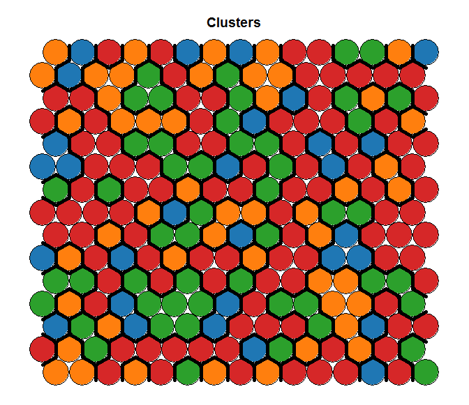 Segments computed on the Original Space Segments computed on the Original Space |
So.. what can we do? This may not be an orthodox way of proceeding, but an idea could be to tweak the data structure and force it to give us something we can work with. As kohonen is sensitive to scale, we can force the segments as a new variable on an overly inflated scale. Kohonen will then organize the space to explain the segments, and then will do its best to organize the rest of the information in this forced dimension. We will then get segments that look like this:
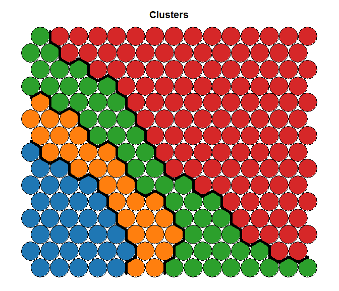 Of course, this has a consequence when it comes to visually represent the data structure. But we must ask the question: Is it better to intent to segment something overly simplified that I can easily describe, or is it better to intent to describe the segments that are most likely in the data? To answer this question, I’ll quote Einstein:
“Everything should be made as simple as possible, but not simpler”
On the right, the structure of the initial data is nicely represented, but the segments hard to interpret (and most likely close to a random grouping), while on the left we have very well represented segment, but the data structure is not as clean. I will leave the question of knowing which is the right one opened, but in my humble opinion… I like the left one better!
 |
 |
So, let’s get to the gently technical question: how do we do this in Anatella?
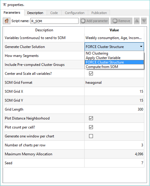 |
As always, we worked hard to make your life easy. The SOM action node (available in DESCRIPTIVE ANALYTICS) will help you do this, in just a few clics an no lines of code:
There are 4 options in the “Generate Cluster Solution”:
|
Would you like to do more? Download the Community Edition of anatella and be awesome.

