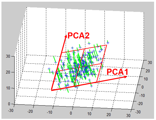
Let’s take another small example:
Here is an illustration on how the “original axises” of the original space BEFORE dimensionality reduction are “projected” inside the reduced space defined by the PCA1 and PCA2 axises:
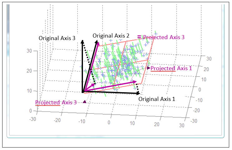
The projection of one original axis inside the spaced defined by the first PCA axises is a “short” vector if the original direction is not preserved very-well after projection (see for example on the above figure, the “original axis 3” which is nearly perpendicular to the PCA plane). The quality of the representation of an original axis is thus proportional to the length of the corresponding vector in the reduced space.
Of course, only the axises that were included inside the “PCA-dimentionality-reduction- computations” can be projected inside the reduced space. The other axis can’t be represented.
The projected axis that “points” in the same direction (inside the reduced space) are representing (positively or negatively) correlated concepts. For example, inside the census-income, we can observe the following:
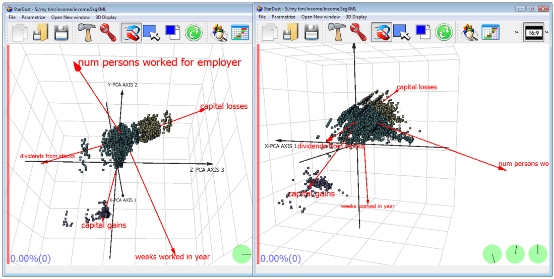
The variables “capital losses”, “capital gains” and “dividends from stocks” are more or less in the same alignment (the sign of the arrows are not the same but the direction is). This means that all these variables are representing more or less the same concept.
There are two more additional concepts that are “perpendicular”: the “num persons worked for empoyer” and the “weeks worked in year”. Thus, you can clearly see the 3 main concepts inside the database: “capital losses”, “num persons worked for empoyer” and the “weeks worked in year”.
You can also see (on the chart on the left) that the yellow segment is mainly composed of people that have high “capital losses”.
You can also see (on the chart on the right) that the purple segment is mainly composed of people that have high “capital gains”.