Inside the AUDIT report, TIMi Modeler also reports many LIFT charts: i.e. One lift chart for each different variable in the dataset. These lift charts represent graphically the accuracy of a “univariate” predictive model that is built using the “current” variable. A “univariate” predictive model is a predictive model that uses only one variable to compute its predictions. For example, for the column “age”, the LIFT chart is:
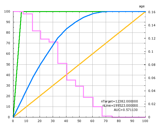
To explain the lift chart, let us assume that we have a “perfect” predictive model that makes no mistakes. This “perfect” predictive model detects without doing any error, all the targets inside your population. In our example, here, the target size is 6% of the population (i.e. there is 6% of the population that earns more than $50K per year). This “perfect” predictive detects 100% of our targets selecting only 6% of the population. The quantity of “detected targets” is displayed on the Y axis while the size of the selection is displayed on the X axis. This “perfect” predictive model is illustrated with the green curve. This green curve goes through the point of coordinates (6% ; 100%) meaning that it’s able to predictive detects 100% of our targets selecting only 6% of the population: ![]()
A “normal” predictive model is forced to “recruit” a lot more than the minimum 6% of the population to find 100% of the target. For example, the univariate predictive model built using the “age” variable must select 70% of the population in order to find all the targets: ![]()
If we only want to find “half the target” (i.e. 3% of the population that are inside the target) using the above univariate predictive model, we will need to select 20% of the population. ![]()
The worse predictive “model” that we can create would “select” people at random. It is illustrated with the yellow line in the lift chart above. This “random” model needs to select 50% of the population to “find” 50% of the targets (it finds them by pure luck). ![]()
Inside TIMi Modeler, the accuracy of the (binary) predictive models is always illustrated using a lift curve (in the chart above: look at the blue curve). The (blue) lift curve of the predictive model is always “in-between” the “perfect model” curve (in green) and the “random model” curve (in yellow). The green curve and the yellow curve thus represent the upper and lower bounds of the accuracy reachable by TIMi Modeler. The higher the (blue) lift curve, the higher the accuracy of the predictive model (but you can never go “above” the green curve).