Let us go back to the variable “age”.
The histogram chart allows you to visualize the relationship that exists between the variable age ![]() and the Target (here: the target is: “the people with a taxable income amount above $50K”).
and the Target (here: the target is: “the people with a taxable income amount above $50K”).
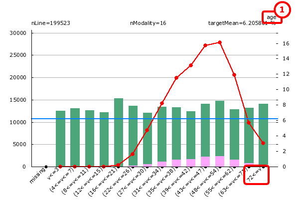
What do we see on the above chart?
TIMi Modeler automatically discretized the variable “age”: it regrouped together the values inside the column ‘age’ into small “bins” or “modalities”. In the chart above, there are 15 modalities. Let’s focus our attention on the modality “72<=v” (that includes all the individuals with an age greater or equal than 72).
You can see on the chart (looking at the green bar), that there are approximately 14 000 records matching this condition. Amongst those 14 000 people, there are 430 targets (look at the very small pink bar). It means that if you pick randomly somebody that is older than 72, there is 430/14 000=.03= 3% chance that this person is a target. The red line on the graph represents the probability that a person is a target in function of its age (for the statisticians: it’s the conditional probability P(target=1| a<=age<=b) ). For example, looking at the red line above, we can see that, for the modality “72<=v”, the probability to be a target is 3% (the red and blue lines refer to the vertical axis on the right and the green and pink bars refer to the vertical axis on the left).
The red line is the most important part of this chart. It allows you to see “trends” and “pattern” linking some specific variables to the target.
The blue line represents:
-The “a priori probability” to be a target or the “natural density” of the target.
-The probability to be a target if you pick somebody at random.
What can we conclude?
In USA, the wealthiest people are between the ages of 47 and 53 (inclusive) (because the red line is the highest in this range). Between the ages of 29 to 61, the red line is above the blue line. It means that, between the ages of 29 to 61, you are wealthier than the common, average guy.