|
<< Click to Display Table of Contents >> Navigation: 5. Detailed description of the Actions > 5.13. TA - R_Discovery Analytics > 5.13.5. Model Clustering (
|
Icon: ![]()
Function: R_MCLUST
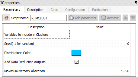
Property window:
Short description:
Model Clustering.
Long Description:
This Action is mainly for explanatory/teaching purposes. If you want to create a better segmentation, you should use Stardust.
This algorithm uses BIC to select optimal solution based on a bunch of hypothesis. Very cool, on SMALL dataset: computation time becomes quickly problematic when applied on a few thousand obervervations, and more than 10 variables is hard to Interpret. For this reason, we nearly always compute PCA before hand when using this technique.
Here is how to interpret the output inside the log window:
“EII”: spherical, equal volume
“VII”: spherical, unequal volume
“EEI”: diagonal, equal volume, equal shape
“VEI”: diagonal, varying volume, equal shape
“EVI”: diagonal, equal volume, varying shape
“VVI”: diagonal, varying volume, varying shape
“EEE”: ellipsoidal, equal volume, shape, and orientation
“EEV”: ellipsoidal, equal volume and equal shape
“VEV”: ellipsoidal, equal shape
“VVV”: ellipsoidal, varying volume, shape, and orientation
MClust gives results consistents with “Latent Class” (see next section 5.12.11). In the following example, we will use the wine dataset available in the datasets directory of Timi.
Chart 1: BIC
The BIC (Bayesian Information Criteria, or Schwartz Criteria) is an extention of Log Likelihood penalizing the number of parameters. In this particular case, it is used to assess the likelihood that a particular structure fits the data better than the others.
BIC=ln(n)k- 2 ln(L).
Basically: the closest to 0, the betters (it can be negative or positive).
In this example, we see there is a maximal value for 4 segments, of type VEE: diagonal, varying volume, and equal shape and orientation.
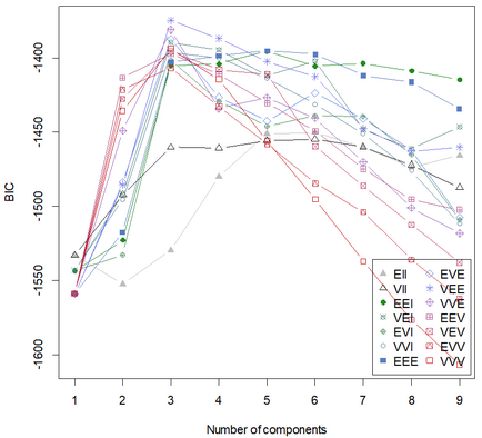
Chart 2: Classification chart
This chart shows a pairwise visualization of the various distributions identified, while plotting each individual point in a color specific to the segment assigned, as well as an estimation of the distribution.
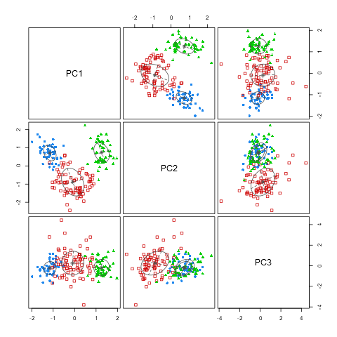
Chart 3: uncertainty
This charts complements the previous one by displaying the points for which there is a high understainty regarding the segment assignation. This helps get a feeling of the risk of mis-assignment of clusters
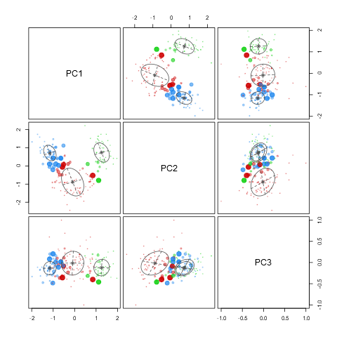
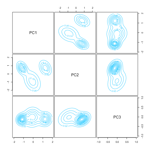
Chart 4: density
This chart displays the density of the segments and how they are positions in the multivariate space. Each line represents a boundary of the confidence we have that a particular point belongs to the distribution (p)
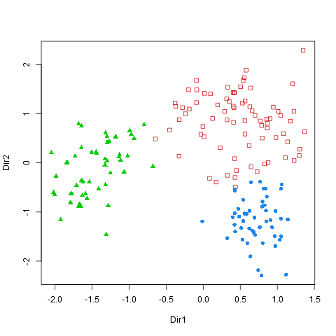
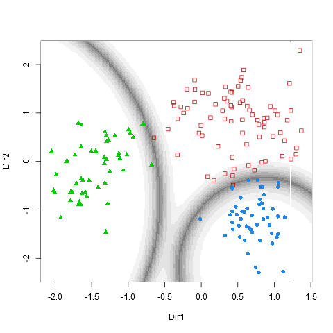
Charts 5-6: Scatterplot and Boundaries
These last two plots are only displayed if the option “Add data reduction outputs” is checked. The two first principal components are displayed with the color codes corresponding to the segments. The boundaries (areas in which misclassification is to be espected) are also displayed.