|
<< Click to Display Table of Contents >> Navigation: 5. Detailed description of the Actions > 5.11. TA - R Visualization > 5.11.3. Scatter Plot (
|
Icon: ![]()
Function: R_Scatter
Property window:
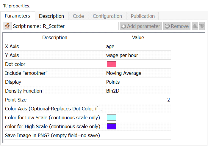
Short description:
Display a Scatter Plot.
Long Description:
Display a Scatter Plot of two series.
To add several series on the same plot, simply append your series vertically, and specify a “partition variable”.
Variables must be numerical, and are automatically converted as they are sent to R for plotting.
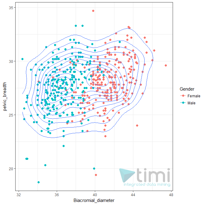
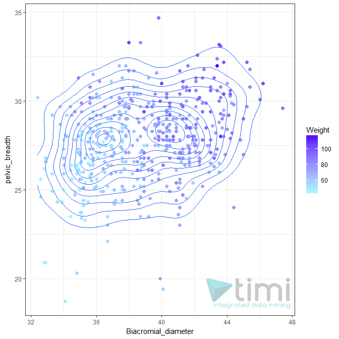
The density function allows you to visualize the most likely bivariate distributions. The CHT Color Axis include a “Color Axis”, which can either be “nominal” (left chart) or “continuous” (right chart):
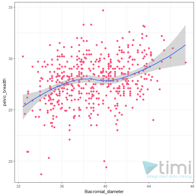
“Include Smoothen” will display a smoothen line to illustrate the relationship between the two variables. It can either be a linear trend (correlation) or a moving average. In either case, the confidence interval is also automatically displayed. You can also add a custom function, or pre-made elasticity curve to explore the relationship between Price and Demand.
Y Axis is a count: in many situations, we want to show aggregated data (for example, to show a demand curve). This makes very few points displayed on the chart, and the “n” row information will make no sense. To keep n as the true number of rows, click this option and the plot will display the sum of Y.