|
<< Click to Display Table of Contents >> Navigation: 5. Detailed description of the Actions > 5.11. TA - R Visualization > 5.11.2. Aggregate & Histogram (
|
Icon: ![]()
Function: R_AggAndHisto
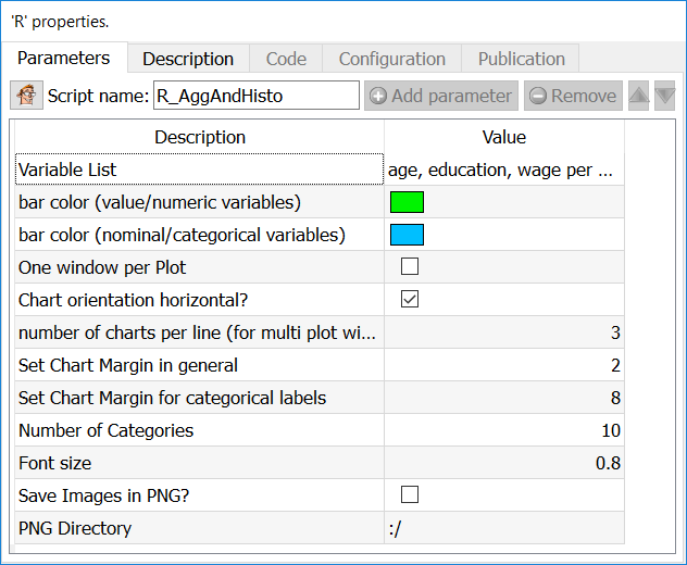
Property window:
Short description:
Aggregate a table and display the variables content in a Histogram chart.
Long Description:
Since the aggregation is performed by the R engine, it’s limited to tables that fits into RAM (and it’s quite slow). To display histogram on unlimited size tables, use the ![]() Histogram Action from the previous section.
Histogram Action from the previous section.
Parameters:
Variable list: Select the variables on which to compute the histograms (or feed from second pin)
LBL: Number of categories: set the number of bins in the histogram (X Axis)
LBL: Label angle for discrete variables: self explanatory
LBL Max Length of Label: set the maximum number of characters to display on X axis.
LBL Font Size: set the font size (default is 0.8)
LBL Thousands Separator: set the thousands separator for easier readability
LBL Categories Order: set the order to display (aqlphabetical, or based on value)
CHT Bar Color for Nominal Variables: select the color for categorical variables
CHT Bar Color for Numerical Variables: select the color for value variables
CHT One Window per Plot: put the histogram of each variable in a separate plot
CHT Chart orientiation horizontal: by default, plots are vertical histograms
CHT Number of charts per line: set how many charts are on the same line, if you have not chosen to make one window per plot.
IMG Run Only Mode: Generate the chart to be saved, but do not display them
IMG Save Images as PNG: choose whether to save the output as a PNG file or not
IMG PNG Directory: choose where to save the file (by default in the active directory “:/”)
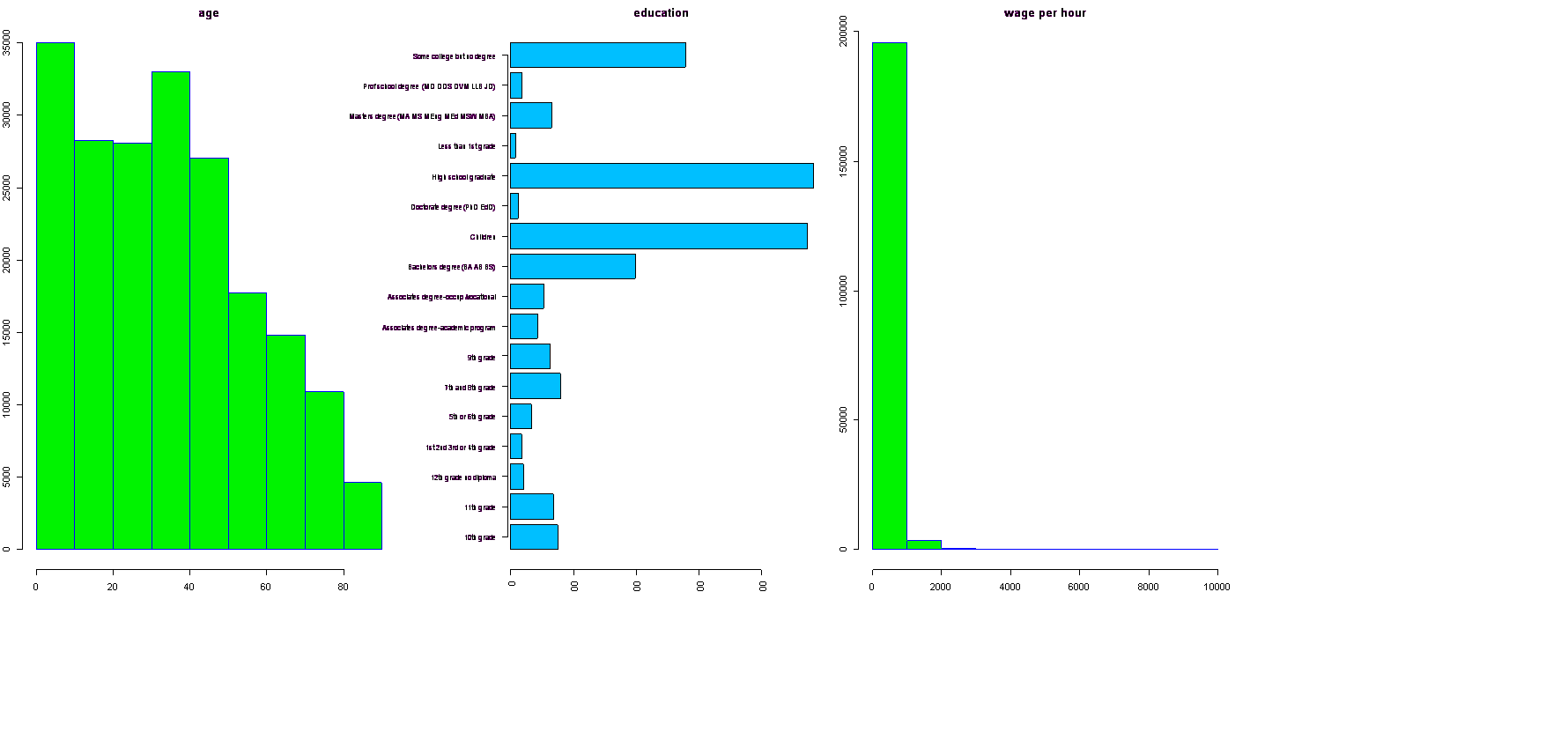
Example
Using the Census Database, we want to make histograms of wage per hour, education level, and age. We will first set to “FLOAT” the type of data for age and Wage per Hour (the type of variable is automatically sent to R, and treated as such).
Then, simply select the variables you wish to generate a histogram for (in our example, age, education, and wage per hour). As “age” and “wage per hour” are both numeric, R will automatically generate a histogram, while we will get a count plot for each category of the “education” variable. As in the previous example, we kept all the plots in a single window. By selecting the option “One Window per Plot” this woud have create a new window for each plot (three separate plots)