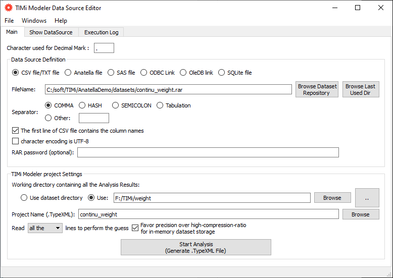
We will now build another kind of predictive model: a predictive model that predicts a continuous value, in opposition to the other sections above where the target was binary (0/1). We will study the dataset named “continu_weight”. This dataset contains on each line a different person. For each person (on each line of the dataset), we measured various body circumference lengths. Based on these lengths, we want to predict the weight of each individual. Let us start by defining where is located our dataset! Run the Datasource Editor and enter the following:
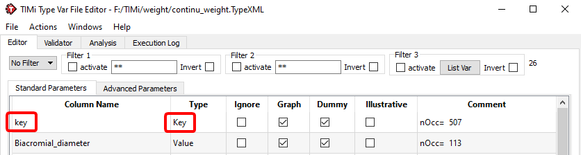
Press the button to generate a new .TypeXML and edit the newly generated .TypeXML file. Enter the following:
...
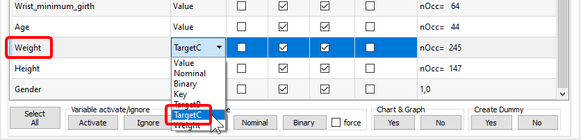
We just selected the column “Weight” as our “Continuous Target” and the column “key” as our primary key. Run the “Univariate Analysis”. You obtain a “weight_AUDIT.doc” file. Open this file and look at the variable “age”:
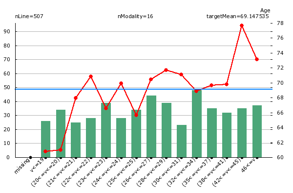
What do we see on the chart above? When we look at the green bar, we see that there are inside our dataset 50 people that are between 32 and 34 years old. Looking at the red line, we see that these same persons have a weight of 68.9 Kg in average.
Open the newly generated “.CfgXML” file editor and run the multivariate analysis: click on the “Run TIMi Modeler” button. Open the final Analyst report inside MS Word. You should get something like this:
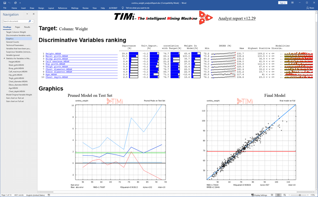
We see that the most important variable to predict the weight is the Height of the person.
Interestingly, the model does NOT use the variable “gender”. Some physicians claim that Males have bigger and heavier bones than Women and thus are inherently heavier. The results presented here contradict this hypothesis since the variable “gender” is not used by the predictive model to do the prediction (Note that this effect could be the result of the relatively small size of our sample: i.e. our sample could be slightly biased).
Let us look at the first graphics (usually named “dot cloud graphic”):
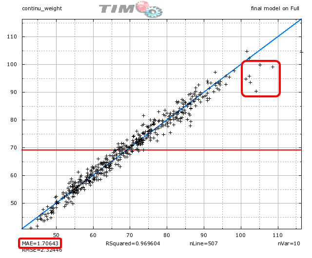
Each point in the “dot cloud graphic” represents a prediction for one individual. The X-coordinate of a point represents the real value to predict. The Y-coordinate of a point is the prediction value. If all predictions are perfects, all the points are aligned on the blue diagonal. We see on the graphic above (look at the red circle) the following: For the people that have very high weight (above 95 Kg), the predictions are too low: the prediction under-evaluate the real weight.
When we apply the model on the whole (full) dataset, the “Mean Absolute prediction Error” (MAE) is 1.70 Kg. It means that, in average, the predictions are wrong by an offset of 1.70 Kg.
On the graphic, you also see a red horizontal line centered at 69 Kg. This is the average weight of the people inside the dataset. On some difficult problems (not this one), it is impossible to predict anything. In such difficult situation, TIMi Modeler delivers a predictive model that always predicts the same constant value: i.e. The average of the target (and then, all the points will be aligned on the red horizontal line).
To summarize:
-when the predictions are easy to do: All the points are aligned on the blue diagonal line.
-when the predictions are difficult to do: All the points are aligned on the red horizontal line.
Let us look at the second graphic:
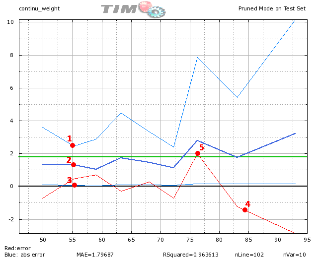
What do we see on the graphic above?
•For the people around 55 Kg (on the X-axis), the absolute prediction error is (95% of the time) between 2.6 Kg (point 1) and .04 Kg (point 3). For these persons, in average, the absolute prediction error is 1.3 Kg (point 2).
•For the people above 80 Kg, the red line is clearly below the zero axis (point 4). It means that the predictions for these persons have strong negative errors: the predictive model under-evaluate the real weight of the persons (this is confirmed by the analysis we did on the previous “dot-cloud” graphic).
•For the people around 77 Kg, the red line is clearly above the zero axis (point 5). It means that the predictions for these persons have strong positive errors: the predictive model over-evaluate the real weight of the persons.
•The dark blue line is higher on the right than on the left: it means that the errors of prediction are higher for heavy persons.