|
<< Click to Display Table of Contents >> Navigation: 5. Detailed description of the Actions > 5.11. TA - R Visualization > 5.11.10. Correspondance Analysis (
|
Icon: ![]()
Function: R_MCA
Property window:
Short description:
Use a Chi-Square approximation to represent an aggregated matrix.
Long Description:
Multiple Correspondance Analysis (MCA is a method often used in Market Research to understand the relationship between brands and attributes. It typically comes in the form:
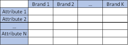
Where all the datapoints are average of the attribute for each brand, or frequency in which the attribute applies.
Multiple Correspondence Analysis is extensively discussed by Hoffman et al, and is a very popular technique in marketing research. Essentially, it is a multi dimensional scaling technique (MDS) that allows representation of multivariate data in a Euclidean space. Using this technique, one looks at the distance between objects to understand the characteristics of various brands on a market place.
While this method is often applied to plot proportions, it will also return valid results based in averages of data. Mapping analysis mostly relies on subjective interpretation of a chart, but the technique also offers metrics that allow us to estimate the validity of the map. The most important metric is the percentage of variance extracted (the amount of differences between brands and attribute correctly represented in the chart).
Scale of the variables is not that important but there MUST be a variance (if a row has identical values for all columns, MCA will fail)
MCA is somewhat related to factor analysis but uses a Chi-Square approximation of the distance, which tends to misrepresent distances near the center of the chart, and often tends to merge two dimensions in one.
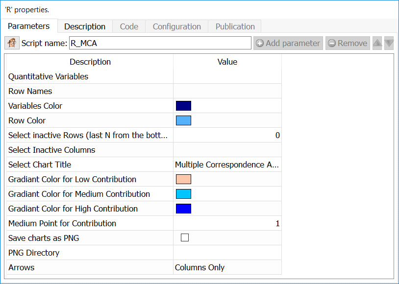
Quantitative Variables: select numerical variables to include in the plot
Row Names: Column with row labels
Variables Color: Set the color to plot column positions
Row Color: Set the color to plot row position
Select Inactive Rows: Select the number or rows from the BOTTOM that will be ignored in the computation, but still plotted
Select Inactive Columns: Select the columns that will be ignored in the computation, but still plotted
Set chart title: set the main label of the chart
Gradiant color for low contribution: set the color to represent points that are poorly represented
Gradiant color for medium contribution: set the color to represent points that are “OK” represented
Gradiant color for high contribution: set the color to represent points that are well represented
Medium point for contribution: set the contribution to set the “OK represented” value (default is 1)
Arrows: select if you want to put arrows on columns variables, row variables, or both
Map: The default plot of (M)CA is a "symmetric" plot in which both rows and columns are in principal coordinates. In this situation, it’s not possible to interpret the distance between row points and column points. To overcome this problem, the simplest way is to make an asymmetric plot. This means that, the column profiles must be presented in row space or vice-versa. The allowed options for the argument map are:
• "rowprincipal" or "colprincipal": asymmetric plots with either rows in principal coordinates and columns in standard coordinates, or vice versa. These plots preserve row metric or column metric respectively.
• "symbiplot": Both rows and columns are scaled to have variances equal to the singular values (square roots of eigenvalues), which gives a symmetric biplot but does not preserve row or column metrics.
• "rowgab" or "colgab": Asymmetric maps, proposed by Gabriel & Odoroff (1990), with rows (respectively, columns) in principal coordinates and columns (respectively, rows) in standard coordinates multiplied by the mass of the corresponding point.
• "rowgreen" or "colgreen": The so-called contribution biplots showing visually the most contributing points (Greenacre 2006b). These are similar to "rowgab" and "colgab" except that the points in standard coordinates are multiplied by the square root of the corresponding masses, giving reconstructions of the standardized residuals.
Intepretation
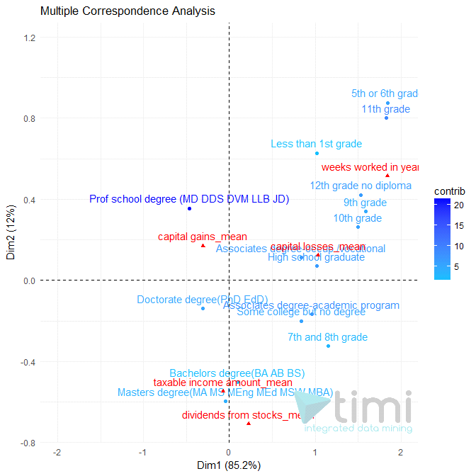
•Taxable income Amount is mostly explained by levels of education of Bachelor and Masters degree, and seems to occur more with high “dividend from stock”.
•Those with a professional degree tend to have more capital gain, but less “taxable income”.
•Those with the lowest education tend to work more weeks per year, and have the least chances to be rich.
Note that if you run a TIMi Model to predict “Taxable income amount”, you will have a much better understanding of the dynamics, and some conclusions of this map will even turn out to be erroneous. Use interpretation very cautiously.
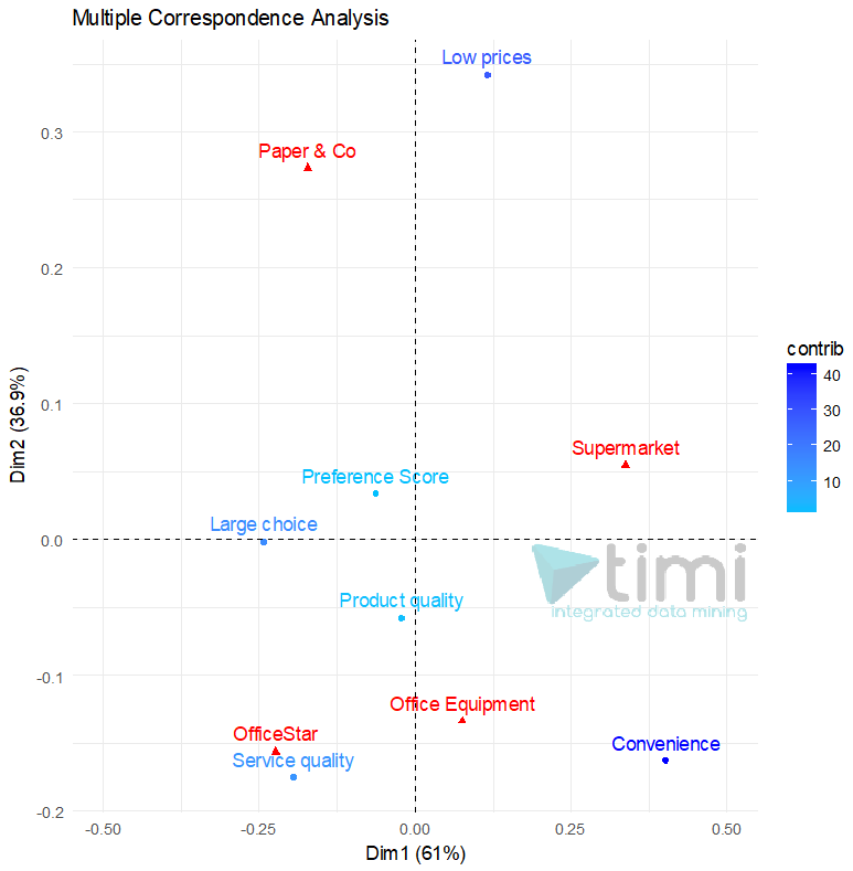
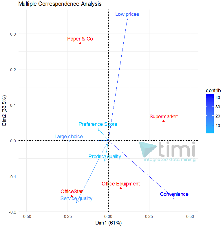
In the following example (courtesy of prof. A. De Bruyn. ESSEC), we see that OfficeStar is set apart by Service Quality, and convenience applies equally to OfficeEquipment and SuperMarket. Paper & Co is only set apart by Low Prices, where it is the only relevant brand.