Icon: ![]()
Function: writeReport
Property window:
Short description:
Injects into the charts of a MS-Office document (excel, word or powerpoint) some data coming from the transformation graph.
Long Description:
This Action injects into the charts of a MS-Office document (MSExcel, MSWord or MS-Powerpoint) some data coming from the transformation graph. This allows you to automatically& instantaneously update & refresh all the charts contained into a set of “report templates” defined with MSOffice.
Let’s give a small example. We want to update, using Anatella, two charts inside a MSPowerpoint presentation. Let’s first create the two charts using MSExcel: The procedure is quite trivial for anyone trained in MSExcel:
1.The first chart contains two “series” (in MSOffice technical terms): The first serie is a histogram and the second serie is a line. We will use fake data to create the chart. These “fake data” will, anyway, be replaced by the data coming from the Anatella Graph. Let’s create the first serie (histogram):
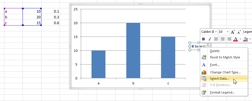
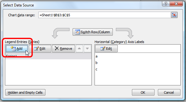
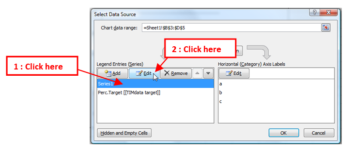
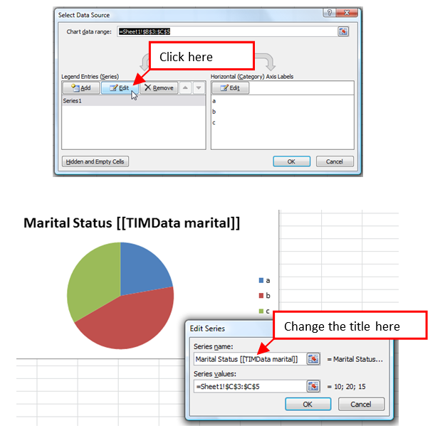
2.Let’s create the second serie: right-click on the “Series1” legend and select the option “Select Data” inside the dropdown-menu. A new window opens. Click the “Add” button inside the new window to add the second serie:
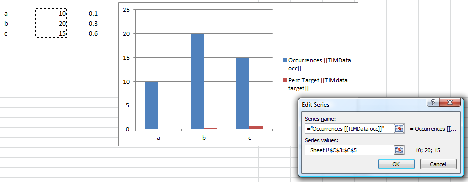
Configure the title and the data from the second serie:
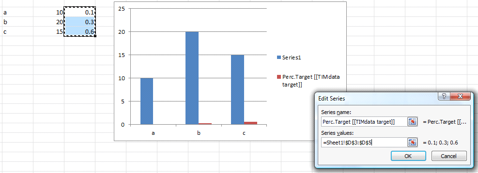
Please note the title of the second serie: “Perc.Target [[TIMdata target]]”.
This title is special it contains the tag “TIMData”.
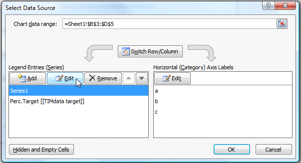
Anatella reads the MSOffice document and extract all the names of all the “TIMData” tags (in the example here above the name of the “TIMData” tag is “target”). You will thereafter use these tag names to configure, for each different serie, where the data coming from the Anatella graph must be injected into the MSOffice document. Let’s also change the title of the first serie: Click the “OK” button to close the “edit serie” window, select the first serie and click the “Edit Button”:
The Title of the first serie is “Occurences”. The name of the TIMData tag is “occ”.
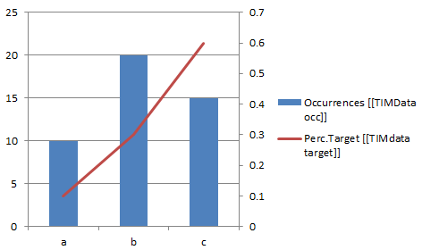
Let’s beautify a little bit the chart:
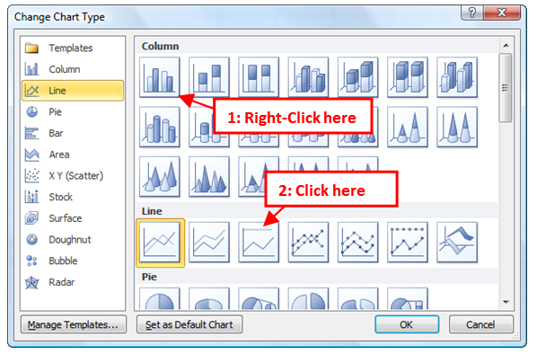
oChange the “Serie Chart type” of the second serie to “Line”: Right-click on the “Perc.Target” legend and select the option “Change serie chart type” inside the dropdown-menu. A new window opens. Select the “line” type:
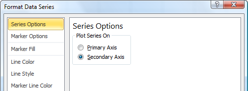
oChange the axis of the second serie to “Secondary Axis”: Right-click on the “Perc.Target” legend and select the option “Format Data Series” inside the dropdown-menu. A new window opens. Select “Secondary Axis”:
oYou can also change the colors and the overall look of the chart in any way you want.
We finally have: For the first chart:
Copy-paste this chart inside your MSPowerpoint presentation.
The second chart contains only one “serie”: a pie chart. Create a simple pie-chart, using, once again, fake data:
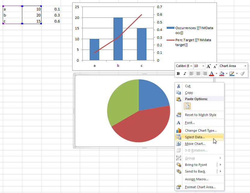
…and change the name of the serie to “Marital Status [[TIMData marital]]”:
Copy-paste this second chart inside your MSPowerpoint presentation.
We have now a MSPowerpoint document that contains these 2 charts:
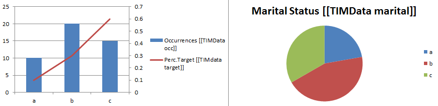
Our MSPowerpoint document now contains 3 series that are identified using their “TIMdata” tag:
occ
target
marital
We will use Anatella to update the data displayed in these 3 series. Anatella will replace the “fake” data that we used to build the charts by data computed inside the transformation graph. We will use the first chart to illustrate:
•The distribution of the “Education” variable (using the serie named “Occ”): More precisely: We want on the Y-Axis the number of people for a specific education on the X-Axis.
•The percentage of people earning more than $50.000 per year (i.e. “wealthy” people) in function of their education (using the serie named “target”): More precisely: We want on the Y-Axis the percentage of wealthy people for a specific education on the X-Axis.
We will use the second chart (i.e. the pie chart) to illustrate the distribution of the “Marital Status” variable inside our population (using the serie named “marital”): More precisely: Each pie represents the number of people with a specific “Marital Status”.
Let’s first generate all the data that we need:
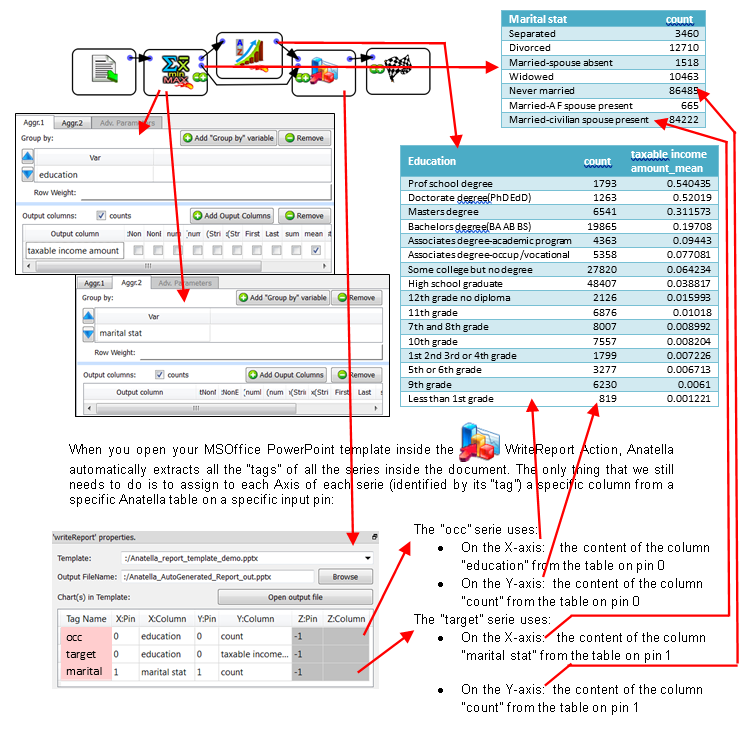
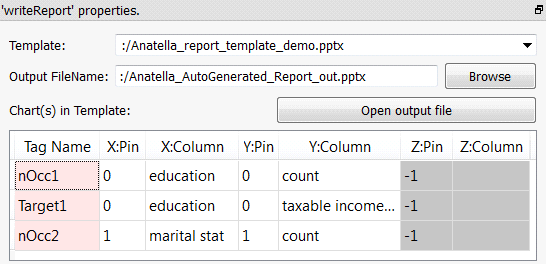
When you open your MSOffice PowerPoint template inside the ![]() WriteReport Action, Anatella automatically extracts all the “tags” of all the series inside the document. The only thing that we still needs to do is to assign to each Axis of each serie (identified by its “tag”) a specific column from a specific Anatella table on a specific input pin:
WriteReport Action, Anatella automatically extracts all the “tags” of all the series inside the document. The only thing that we still needs to do is to assign to each Axis of each serie (identified by its “tag”) a specific column from a specific Anatella table on a specific input pin:
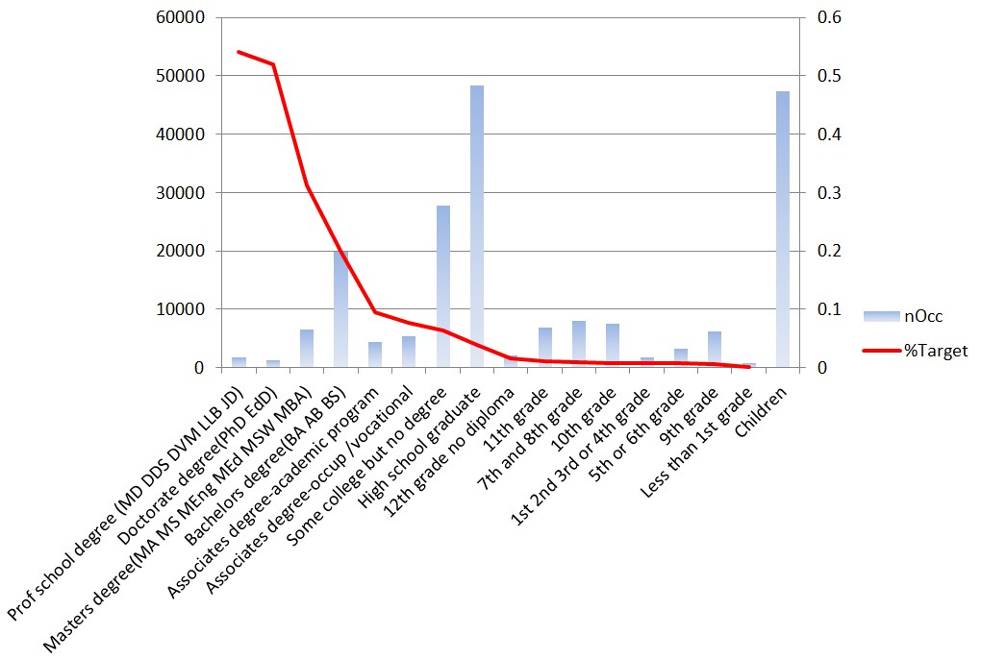
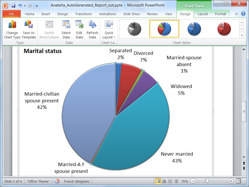
At the end, we get the 2 following charts :

![]()
Tip: You can use the “Styling” option to quickly “beautify” your charts:
If you intend to redistribute your charts to many people, you should know that there exists an annoying bug inside MSPowerpoint related to “Styles”. If you try to open a .pptx file containing a chart that has a “user-defined-style” that is not installed on your computer, then MSPowerpoint resets the colors & layout (i.e. the “style”) of the chart to a default ugly value. There are 3 solutions to this problem:
1. Save the file (i.e. the.pptx, .docx, .xlsx file) as a PDF file and distribute the PDF file (and not the .pptx file). This is the easiest solution.
2. Change the colors & layout of your charts without using the “quick styling” option in the toolbar (i.e. use the slower “Format plot Area”, “Format data points” options).
3. Verify that the styles that you are using are also on the PC of the people that are receiving your charts.